Typetecture
A personal project that emerged from my passion for typography and architecture. I'd like to share this journey with others who appreciate the beauty in design.
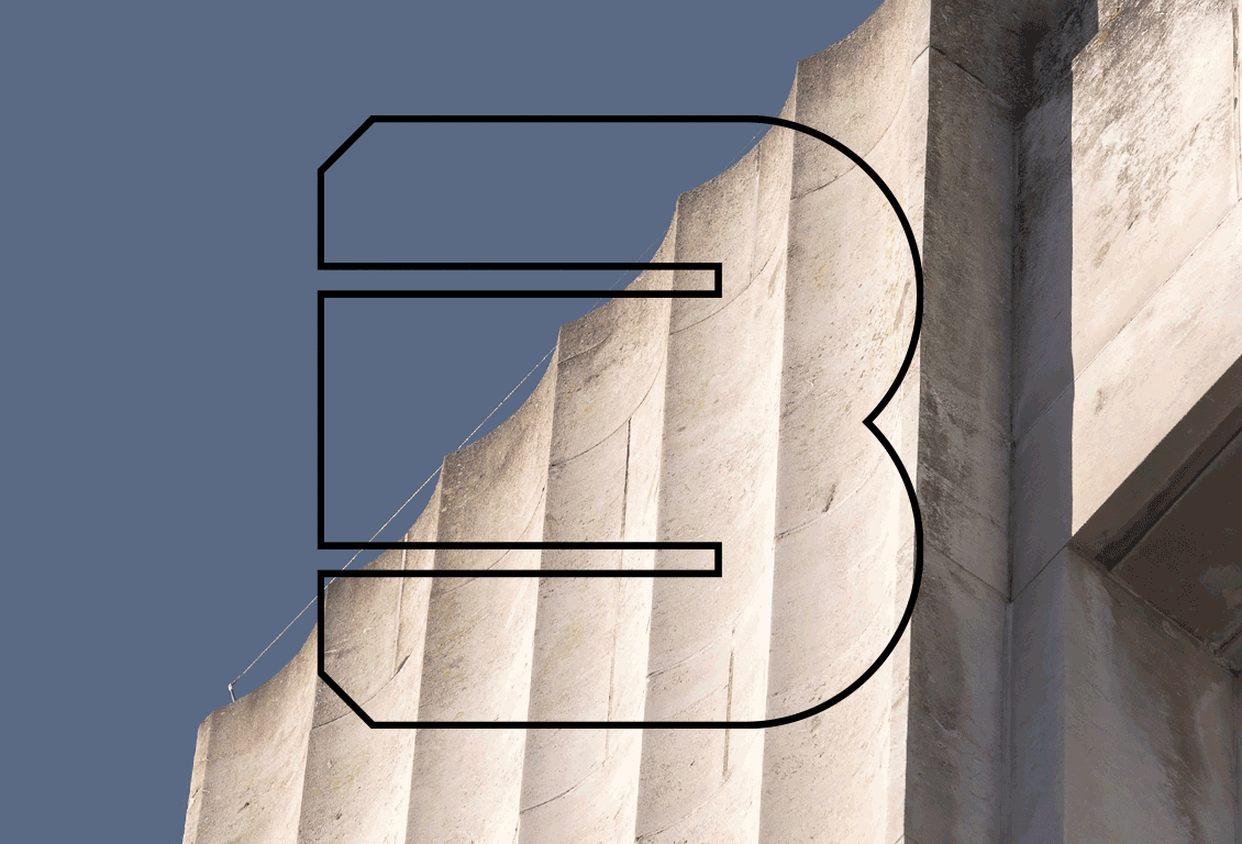
This is the result of my experience as a flâneur. Typetecture is a bold, abstract, and architectural typography that is not intended to be readable; it evokes the idea of modernist architecture through pictorial language.


Plymouth was one of the most intensively bombed British cities during WW2. However, the government and the press censored stories about it, at that time concentrating on London & Coventry. A Plan for Plymouth, by urban planner Patrick Abercrombie and engineer J Paton Watson, was designed in 1943 in response to the necessity to rebuild the city. Sir Abercrombie designed a city inspired by the Beaux-Arts movement. Abercrombie and Paton-Watson envisaged a grand, symmetrical metropolis around a main road from the train station to the ocean.
Plymouth City Centre is a unique example of architecture in recent history thanks to the materials used and the buildings' classical aesthetic, with beautiful metaphorical and ocean-inspired reliefs on the facades. However, the city's decay is visible due to different economic crises and years of lack of interest in maintaining Plymouth's heritage.
The information acquired during the research allowed me to start sketching a bespoke alphabet inspired by the City. Urban elements such as manhole covers, cobblestone paths, and iconic buildings are the basics of the typography. The letterforms had to look square to represent the architecture of the City, which is why it was designed within a restrictive grid to pay homage to Abercrombie’s grid and illustrate the idea of modernism. The result is a bold, architectural, and abstract typography that is not intended to be readable; it evokes the idea of modernist architecture through pictorial language.
The Typetecture book condenses the information acquired during the research process. Its layout illustrates the city centre’s raw and modernist aesthetic. Moreover, it is a dynamic book with foldout pages, the use of tracing paper to pay homage to architectural projects, and the French fold technique.
Plymouth stands unique among the many blitzed cities engaged in post-war planning and development (…) because of the radical nature of the planning proposals
(The Architect’s Journal. June 12, 1952 )
The book features the alphabet, photographs of iconic buildings that inspired the design of the letterforms, and key historical facts related to World War II and the city's reconstruction plan. These key facts are linked with a letter:
A. Abercrombie. Sir Patrick Abercrombie designed A Plan for Plymouth after the Second World War.
B. Blitz. During March and April 1941, the city suffered a series of raids known as the Plymouth Blitz.
C. Charles Church. The remains of Charles Church (1646) are preserved as a living memorial.
F. Flagpole. Until recent years, every building had a flagpole.
H. Houses. Over 22,143 houses were damaged or destroyed.
I. Incendiaries. More than 205k incendiary bombs were dropped on the city.
J. July. The first bombardment of the city was July 6th 1940.
M. Metropolis. Abercrombie and Paton Watson designed as a grand metropolis
N. Nautical details. Nautical reliefs are carved in some buildings.
P. Pneumonia Square. The Plan is too vast, creating a cold atmosphere.
S. Shoppers. 40k shoppers arrived for Dingles’ opening in 1951.
T. Typography. Bespoke typography inspired by the City Centre architecture.
U. Utopia. The Plan for Plymouth was designed to create a utopian city.
V. Visitors guide. The main axis from the train station to the Hoe was conceived as “the visitors’ guide.”


